Appearance
Skip to content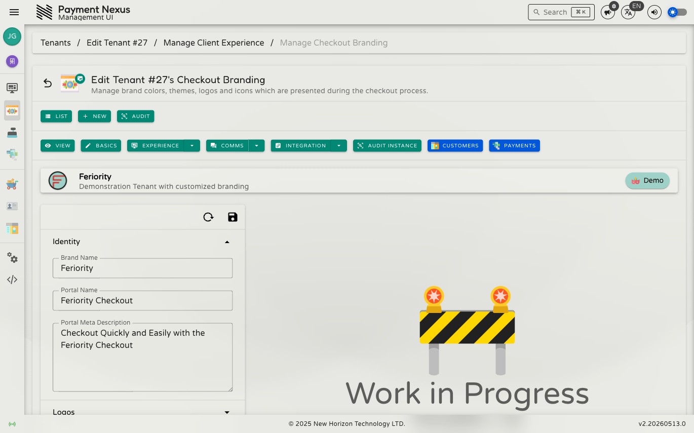
Checkout Branding
Checkout Branding controls how a brand appears to customers during the checkout process — logos, icons, brand colours, semantic theme palettes, and the copy used in the checkout UI. Changes here affect the live checkout experience for all customers under this brand.
Permissions
| Action | Permission required |
|---|---|
| Edit checkout branding | tenant:update:branding |
Sections
The form is organised into six collapsible sections. Expand a section to edit its fields; collapse it to save space. A validation error indicator appears on the section header if any field within it is invalid.
Identity
Core identity strings used in the checkout portal.
| Field | Description |
|---|---|
| Brand Name | The name shown to customers as the brand (e.g. in page titles and headings) |
| Portal Name | The name of the checkout portal itself, distinct from the brand name |
| Portal Meta Description | The HTML <meta name="description"> content for the checkout portal, used by search engines and link previews |
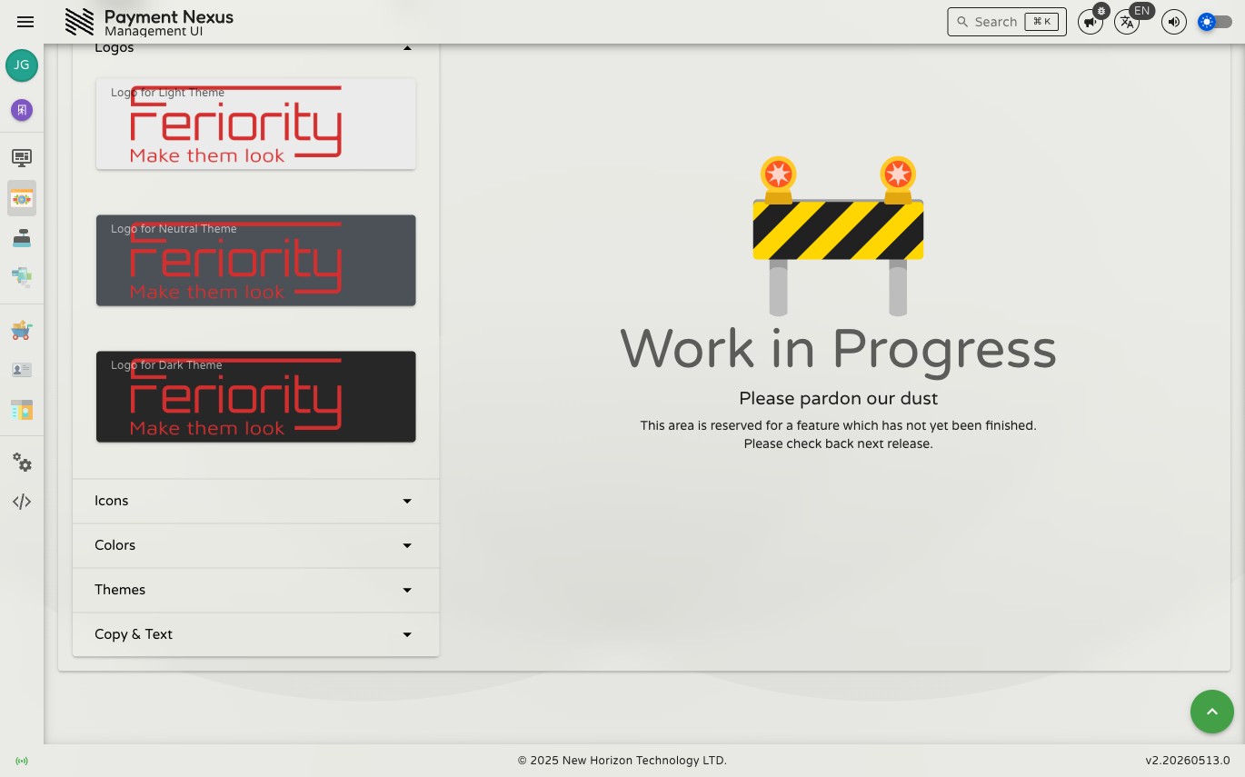
Logos
Full-width logotype images used in the checkout UI. A separate logo can be supplied for each visual theme so the brand's mark always looks correct against any background.
| Field | Description |
|---|---|
| Logo for Light Theme | SVG logo displayed when the checkout uses a light theme |
| Logo for Neutral Theme | SVG logo displayed when the checkout uses a neutral (mid-tone) theme |
| Logo for Dark Theme | SVG logo displayed when the checkout uses a dark theme |
Images are stored as Base64-encoded SVG data URIs.
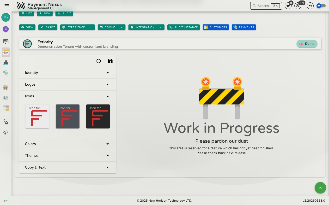
Icons
Square icon images (favicons / app icons) for each visual theme. These appear in browser tabs and as shortcut icons.
| Field | Description |
|---|---|
| Icon for Light Theme | Square SVG icon for light theme contexts |
| Icon for Neutral Theme | Square SVG icon for neutral theme contexts |
| Icon for Dark Theme | Square SVG icon for dark theme contexts |
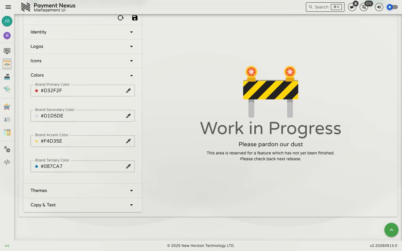
Colors
The four brand colours that seed the checkout palette. These are used directly in UI elements and as the basis for the per-theme colour overrides in the Themes section.
| Field | Description |
|---|---|
| Brand Primary Color | The main brand colour — used for primary buttons, links, and key UI elements |
| Brand Secondary Color | A supporting colour for secondary actions and accents |
| Brand Accent Color | A highlight colour for emphasis elements |
| Brand Tertiary Color | A fourth brand colour for additional visual variety |
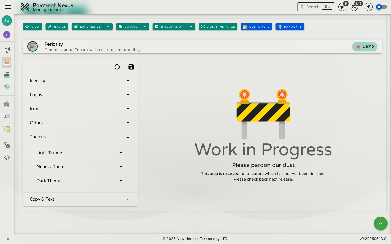
Themes
Fine-grained semantic colour palettes for each of the three checkout visual themes: Light, Neutral, and Dark. Each theme has the same set of ten colour roles.
| Field | Description |
|---|---|
| Background | Page background colour |
| Surface | Card and panel surface colour |
| Highlight | Interactive highlight and focus colour |
| Info | Informational state colour |
| Success | Success/confirmation state colour |
| Notify | Notification/alert state colour |
| Warning | Warning state colour |
| Error | Error state colour |
| Question | Question/prompt state colour |
| Cancel | Cancel/destructive action state colour |
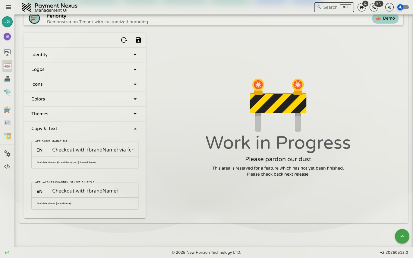
Copy & Text
Customisable strings used in the checkout portal UI. Each term supports macro substitution.
| Term | Macros available | Description |
|---|---|---|
app.pages.main.title | brandName, channelName | The main page title shown in the checkout portal |
app.layouts.channel_selection.title | brandName | The title shown on the payment channel selection screen |
Macros are written as {{macroName}} in the term value and are substituted at render time with the relevant runtime values.
TIP
A right-hand preview panel is planned but not yet available. Save changes and open the checkout portal directly to verify how branding appears to customers.
Saving changes
Click Save to apply all changes across all sections, or Reset to revert to the last saved values. Validation runs across all sections on save — check each section header for error indicators if the save is rejected.